
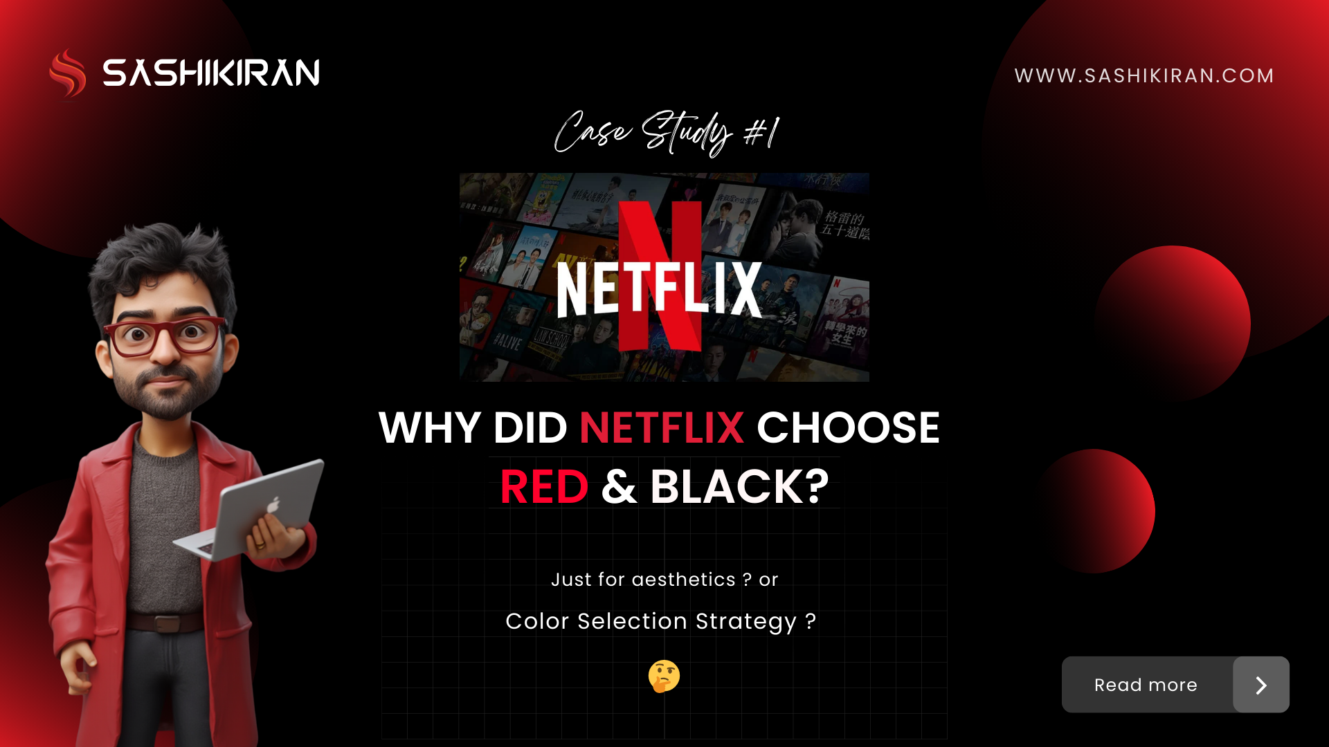
Netflix’s Color Strategy: Why Red and Black Rule Streaming Design
If you’ve ever opened the Netflix app, you’ve likely felt it — the bold red and immersive black interface that draws you straight into binge mode. But have you ever wondered: Why did Netflix choose red and black as its brand colors?
In this article, we’ll unpack the Netflix color palette, explore the role of color psychology in UX design, and understand how memory, emotion, and environment influence product decisions that millions experience every day.
Netflix’s Red 🔴 : Not Just a Logo, But a Feeling
Red is a powerful, emotionally charged color. In UX design and branding, it typically symbolizes:
- Passion and excitement
- Urgency and energy
- Recognition and memorability
But Netflix’s choice of red goes deeper than emotion. It draws inspiration from a time before streaming — from American movie theaters.
Red velvet seats, heavy curtains, glowing exit signs — all part of the traditional theater experience. Netflix’s use of red is a visual anchor, evoking the nostalgia of going to the movies and bringing that memory to life in the digital age.
Why Black ⬛ Dominates the Netflix Interface
Black isn’t just sleek — it’s strategically immersive.
In cinema halls, the lights go out and the world disappears into darkness, heightening the focus on the screen. Netflix recreates that with its deep black interface:
- Minimal distraction: Everything fades but the content
- Premium look: A dark interface feels elegant and cinematic
- Dark mode leader: Netflix popularized dark UI before it became a tech-wide standard
This black background lets thumbnails, titles, and previews stand out with vibrancy, creating a theater-like experience at home.
Designing with Memory and Sensory Recall
Netflix’s color selection is a classic case of memory-driven design — using familiar sensory cues to build emotional connections.
Rather than following design trends, Netflix leaned on environmental memory:
- Red = triggers excitement and cinematic nostalgia
- Black = replicates immersive, low-light viewing
This method aligns with color psychology in UX — where colors aren’t just decorative, but emotional codes linked to behavior, setting, and experience.
What UX Designers and Product Teams Can Learn
If you’re a designer or product strategist, here’s what you can take away from the Netflix color palette strategy:
- Design from Experience: Instead of inventing, recreate what people love and remember.
- Use Color as Context: Tie colors to the environment your users are likely in (e.g., low light for streaming).
- Create Mood with Interface: Use color to control user mood, not just branding.
Netflix proves that design rooted in experience is more powerful than design rooted in aesthetics alone.
Final Thought
Netflix’s red and black isn’t just good design — it’s great emotional engineering.
By tapping into memory, mood, and cinematic nostalgia, Netflix created a user experience that feels familiar yet futuristic. Their success shows how much power lives in the color choices we make — especially when those choices are based on real-world user behavior and sensory memory.
For more deep dives into design psychology, color strategy, and AI in UX, follow Sashikiran on LinkedIn and WhatsApp Channel.
And if you’re a designer looking to build human-centered, culture-aware digital products, don’t miss the book: 7S Design Framework — where strategy meets emotion in product design.